Someone wanted an evaluation of Ashcroft polling (possibly Dan Hardie). LSE‘s election forecasting project has tried to characterise the difference between their model and Ashcroft observations. They are looking at this in the opposite sense, because they have a forecasting model and Ashcroft polls offer more observations to constrain it with, but you could also look at it as being how much they diverge from an adjusted, blended national VI uniform swing model. Going straight to a chart:
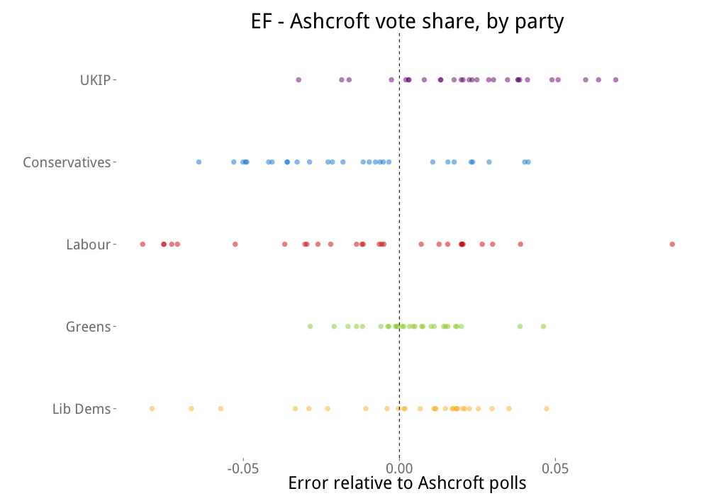
A higher result for LSE’s model than Ashcroft’s poll is to the right, and vice versa. Also, this chart shows us the degree of variance in these results through their spread.
So it looks like LSE reads high/Ashcroft low on UKIP and Ashcroft reads low/LSE high on Tories. There is quite a bit of variation, but the distinction is clear. LSE is high/Ashcroft low on the Greens, but not by much, although the difference is very consistent. On Labour and the Lib Dems, there doesn’t seem to be a systematic difference and there is a lot of variability, i.e. randomness.
I think I said earlier that the big difference between pollsters at the moment seems to be how they split Tories and ‘kippers.
That makes sense considering where UKIP arein the polls ,any differences re SNP ?
I’d be interested in anything able to shed light on how The SNP vote changes the national LAB vote in the pollls and how assumptions around turn out/certainty to vote changes things for the SNP v Labour in Scotland ?